
Modeling NBA salary with bio-metric features
Predicting NBA salary from biological stats.
I will follow the paradigm set out by ML lessons:
- Find data sources
- Explore and visualize the data
- Clean data,
- Feature engineer
- Additional data
- Train models
- Deploy best model.
Refs: IBM, coursera,
Imports and settings
# Other
import os

#data science
import pandas as pd
import numpy as np

# Machine Learning
from sklearn.linear_model import LinearRegression
from sklearn.linear_model import Ridge
from sklearn.model_selection import train_test_split
from sklearn.preprocessing import StandardScaler
from sklearn.pipeline import make_pipeline
from sklearn.preprocessing import PolynomialFeatures

# Visualization
import matplotlib.pyplot as plt
plt.rcParams.update({'font.size': 14,
                    'figure.figsize':(11,7)})
def plot_metric_salary(metric, joined_data):
    joined_data_replace_nan = joined_data.fillna(0)
    data = joined_data_replace_nan[joined_data_replace_nan[metric] > 0]
    plt.scatter(x=data[metric], y=data['Log Salary (M $)'],
                s=50, alpha=0.5)
    plt.xlabel(metric)
    plt.ylabel('Log Salary (Millions, $)')
    plt.show()
Find data sources
These are from kaggle: player salary and player bio stats
player_salary = pd.read_csv(os.path.join('NBA_data','player_salary_2017','NBA_season1718_salary.csv'))
player_salary.tail()
| Unnamed: 0 | Player | Tm | season17_18 | |
|---|---|---|---|---|
| 568 | 569 | Quinn Cook | NOP | 25000.0 |
| 569 | 570 | Chris Johnson | HOU | 25000.0 |
| 570 | 571 | Beno Udrih | DET | 25000.0 |
| 571 | 572 | Joel Bolomboy | MIL | 22248.0 |
| 572 | 573 | Jarell Eddie | CHI | 17224.0 |
From statista, the minimum salary is $815615. So let’s elminate anyone with a salary below that. I’m not sure how they snuck in there!
player_salary = player_salary[player_salary['season17_18'] >= 815615]
player_bio_stats = pd.read_csv(os.path.join('NBA_data','player_measurements_1947-to-2017','player_measures_1947-2017.csv'))
player_bio_stats.head()
| Player Full Name | Birth Date | Year Start | Year End | Position | Height (ft 1/2) | Height (inches 2/2) | Height (in cm) | Wingspan (in cm) | Standing Reach (in cm) | Hand Length (in inches) | Hand Width (in inches) | Weight (in lb) | Body Fat (%) | College | |
|---|---|---|---|---|---|---|---|---|---|---|---|---|---|---|---|
| 0 | A.C. Green | 10/4/1963 | 1986 | 2001 | F-C | 6.0 | 9.0 | 205.7 | NaN | NaN | NaN | NaN | 220.0 | NaN | Oregon State University |
| 1 | A.J. Bramlett | 1/10/1977 | 2000 | 2000 | C | 6.0 | 10.0 | 208.3 | NaN | NaN | NaN | NaN | 227.0 | NaN | University of Arizona |
| 2 | A.J. English | 7/11/1967 | 1991 | 1992 | G | 6.0 | 3.0 | 190.5 | NaN | NaN | NaN | NaN | 175.0 | NaN | Virginia Union University |
| 3 | A.J. Guyton | 2/12/1978 | 2001 | 2003 | G | 6.0 | 1.0 | 185.4 | 192.4 | 247.7 | NaN | NaN | 180.0 | NaN | Indiana University |
| 4 | A.J. Hammons | 8/27/1992 | 2017 | 2017 | C | 7.0 | 0.0 | 213.4 | NaN | NaN | NaN | NaN | 260.0 | NaN | Purdue University |
I want to limit my predictor data to match my salary data: Players active in 2017-2018 season
From the first entry, A. C. Green, I can understand the convention for this dataset. A. C. Green’s first season was the 1985-1986 season and his last season was the 2000-2001 season. So the Year Start and Year End columns use the later year of the season.
(Note, that’s a super long career A. C.!
player_bio_1718 = player_bio_stats[
    (player_bio_stats['Year Start'] <= 2018)&(player_bio_stats['Year End'] >= 2018)
].reset_index(drop=True)
player_bio_1718.head()
| Player Full Name | Birth Date | Year Start | Year End | Position | Height (ft 1/2) | Height (inches 2/2) | Height (in cm) | Wingspan (in cm) | Standing Reach (in cm) | Hand Length (in inches) | Hand Width (in inches) | Weight (in lb) | Body Fat (%) | College | |
|---|---|---|---|---|---|---|---|---|---|---|---|---|---|---|---|
| 0 | Aaron Brooks | 1/14/1985 | 2008 | 2018 | G | 6.0 | 0.0 | 182.9 | 193.0 | 238.8 | NaN | NaN | 161.0 | 2.7% | University of Oregon |
| 1 | Aaron Gordon | 9/16/1995 | 2015 | 2018 | F | 6.0 | 9.0 | 205.7 | 212.7 | 266.7 | 8.75 | 10.5 | 220.0 | 5.1% | University of Arizona |
| 2 | Abdel Nader | 9/25/1993 | 2018 | 2018 | F | 6.0 | 6.0 | 198.1 | NaN | NaN | NaN | NaN | 230.0 | NaN | Iowa State University |
| 3 | Adreian Payne | 2/19/1991 | 2015 | 2018 | F-C | 6.0 | 10.0 | 208.3 | 223.5 | 276.9 | 9.25 | 9.5 | 237.0 | 7.6% | Michigan State University |
| 4 | Al Horford | 6/3/1986 | 2008 | 2018 | C-F | 6.0 | 10.0 | 208.3 | 215.3 | 271.8 | NaN | NaN | 245.0 | 9.1% | University of Florida |
Explore and visualize the data
player_salary['Salary (Million USD)'] = player_salary['season17_18']/1000000
fig, ax = plt.subplots(1,2, figsize=(11*2,7))
plt.subplot(1,2,1)
plt.hist(player_salary['Salary (Million USD)'], align='right',rwidth=.95,)
plt.ylabel("Frequency")
plt.xlabel("Salary (Millions, $)")
plt.fig_size=(11,7)
plt.subplot(1,2,2)
plt.hist(player_salary['Salary (Million USD)'], align='right',bins=400,
                                  cumulative=True,
                                  density=True,
                                  histtype='step'
                                 )
plt.ylabel("Cumulative probability")
plt.xlabel("Salary (Millions, $)")
plt.fig_size=(11,7)

plt.show()
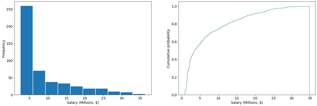
These data are highly skewed, with a mean near \$7.0 M/year and a standard deviation of \$7.2 M/year, and a long tail towards the higher salaries
player_salary['Salary (Million USD)'].mean(), player_salary['Salary (Million USD)'].std(),
(7.001891322851145, 7.336425350468712)
Join the data
I have my predictor and response variables: biological stats and salary
player_bio_1718['Player'] = player_bio_1718['Player Full Name']
joined_data = player_bio_1718.merge(player_salary, on="Player")
joined_data.head()
| Player Full Name | Birth Date | Year Start | Year End | Position | Height (ft 1/2) | Height (inches 2/2) | Height (in cm) | Wingspan (in cm) | Standing Reach (in cm) | Hand Length (in inches) | Hand Width (in inches) | Weight (in lb) | Body Fat (%) | College | Player | Unnamed: 0 | Tm | season17_18 | Salary (Million USD) | |
|---|---|---|---|---|---|---|---|---|---|---|---|---|---|---|---|---|---|---|---|---|
| 0 | Aaron Brooks | 1/14/1985 | 2008 | 2018 | G | 6.0 | 0.0 | 182.9 | 193.0 | 238.8 | NaN | NaN | 161.0 | 2.7% | University of Oregon | Aaron Brooks | 319 | MIN | 2116955.0 | 2.116955 |
| 1 | Aaron Gordon | 9/16/1995 | 2015 | 2018 | F | 6.0 | 9.0 | 205.7 | 212.7 | 266.7 | 8.75 | 10.5 | 220.0 | 5.1% | University of Arizona | Aaron Gordon | 190 | ORL | 5504420.0 | 5.504420 |
| 2 | Abdel Nader | 9/25/1993 | 2018 | 2018 | F | 6.0 | 6.0 | 198.1 | NaN | NaN | NaN | NaN | 230.0 | NaN | Iowa State University | Abdel Nader | 446 | BOS | 1167333.0 | 1.167333 |
| 3 | Al Horford | 6/3/1986 | 2008 | 2018 | C-F | 6.0 | 10.0 | 208.3 | 215.3 | 271.8 | NaN | NaN | 245.0 | 9.1% | University of Florida | Al Horford | 11 | BOS | 27734405.0 | 27.734405 |
| 4 | Al Jefferson | 1/4/1985 | 2005 | 2018 | C-F | 6.0 | 10.0 | 208.3 | 219.7 | 279.4 | NaN | NaN | 289.0 | 10.5% | NaN | Al Jefferson | 128 | IND | 9769821.0 | 9.769821 |
For the player data, I’m going to look at Height (cm), Weight (lbs), age, …
# Clean this up by converting body fat from string to float
joined_data['Body Fat (%)'] = joined_data['Body Fat (%)'].str.rstrip('%').astype('float') / 100.0
columns = player_bio_1718.columns
metrics = list(columns[7:-2])
# replace Nan with 0 for now, and
# neglect 0 values because these are physical measurements that should never be 0
joined_data_replace_nan = joined_data.fillna(0)
fig, ax = plt.subplots(7,2, figsize=(11*2,7*len(metrics)))
for count, metric in enumerate(metrics):
    data = joined_data_replace_nan[joined_data_replace_nan[metric] > 0]
    ax[count%len(metrics),0].hist(data[metric],rwidth=.95,)
    ax[count%len(metrics),0].set_xlabel(metric)
    ax[count%len(metrics),1].hist(data[metric],
                                  bins=400,
                                  cumulative=True,
                                  density=True,
                                  histtype='step'
                                 )
    ax[count%len(metrics),1].set_xlabel(metric)
for hist in ax[:,0]:
    hist.set_ylabel('Frequency')
for CDF in ax[:,1]:
    CDF.set_ylabel('Cumulative probability')
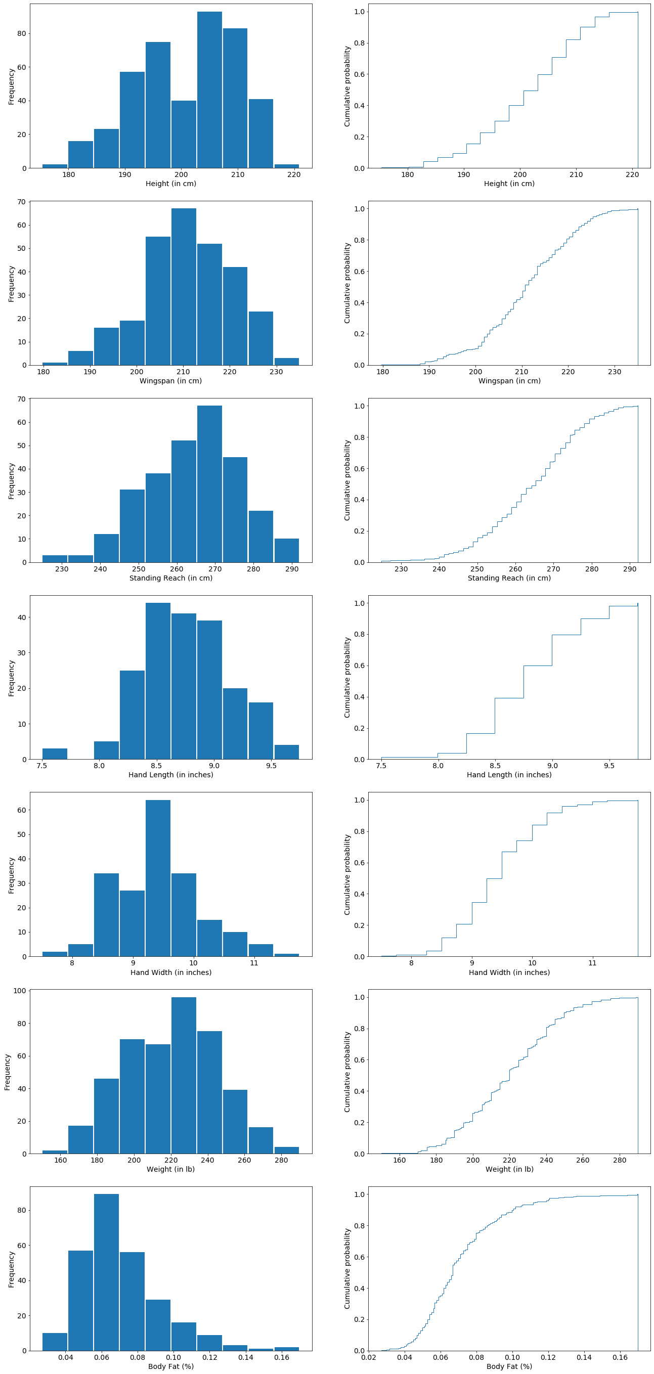
These are looking pretty Gaussian, but I will have to scale them to make their values and ranges similar.
Clean data and Feature Engineer
Salary
The salarys appear roughly log-normal so I am going to transform them to make it look more Gaussian
joined_data['Log Salary (M $)'] = np.log10(joined_data['Salary (Million USD)'])
plt.hist(joined_data['Log Salary (M $)'], align='right',rwidth=.95,)
plt.ylabel("Frequency")
plt.xlabel("Log 10 Salary (Millions, $)")
plt.show()
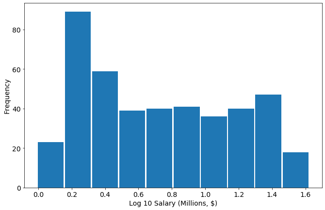
This shows it’s more log uniform than log-normal. Nevertheless let’s proceed:
Let’s see how the biological stats compare to the Log10 Salary
columns = player_bio_1718.columns
metrics = list(columns[7:-2])
scatter_list = []
# replace Nan with 0 for now, and
# neglect 0 values because these are physical measurements that should never be 0
joined_data_replace_nan = joined_data.fillna(0)
fig, ax = plt.subplots(4,2, figsize=(11*2,7*4))
for count, metric in enumerate(metrics):
    data = joined_data_replace_nan[joined_data_replace_nan[metric] > 0]
    ax[count//2, count%2].scatter(x=data[metric],
                               y=data['Log Salary (M $)'],
                                  s=50,
                                 alpha=0.5)
    ax[count//2, count%2].set_xlabel(metric)
    ax[count//2, count%2].set_ylabel('Log Salary (Millions, $)')
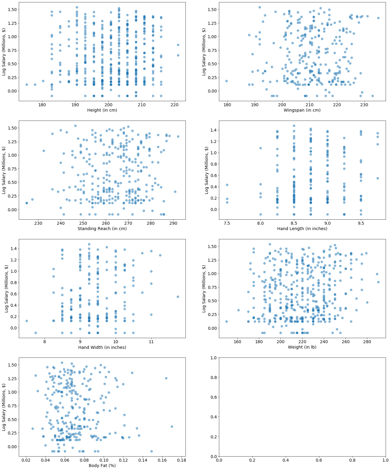
These are looking generally pretty uniform, meaning salary is independent of most of these features.
There some data points at the extremes that stick out. Let’s keep going - maybe we can add some more predictive features.
Create Features
print('Total number of players: '+str(len(player_bio_1718)))
for column in player_bio_1718:
    print(player_bio_1718[column].isna().sum(), column)
Total number of players: 471
0 Player Full Name
0 Birth Date
0 Year Start
0 Year End
0 Position
0 Height (ft 1/2)
0 Height (inches 2/2)
0 Height (in cm)
177 Wingspan (in cm)
177 Standing Reach (in cm)
259 Hand Length (in inches)
259 Hand Width (in inches)
0 Weight (in lb)
190 Body Fat (%)
82 College
0 Player
Predict wingspan
We’re missing a fair amount of data in Body Fat, Wingspan, Reach, and Hand Length and Width. Can we reconstruct it from domain knowledge?
data=player_bio_1718[player_bio_1718['Wingspan (in cm)'] > 0]
x_dim = 'Height (in cm)'
y_dim = 'Wingspan (in cm)'
plt.scatter(
    x=data[x_dim],
    y=data[y_dim],
    alpha=0.5)
plt.xlabel(x_dim)
plt.ylabel(y_dim)
Text(0, 0.5, 'Wingspan (in cm)')
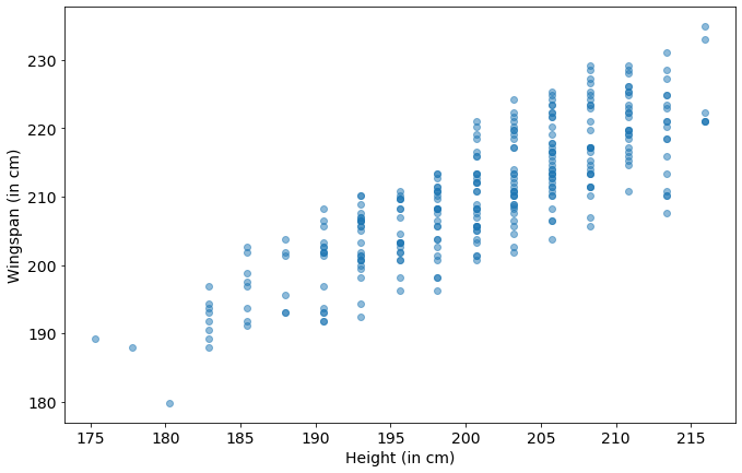
We know that height can be used to predict wingspan fairly well in the general population, and the chart above is promising. Let’s try it.
no_wingspan_data = player_bio_1718[player_bio_1718['Wingspan (in cm)'] > 0]
heights = no_wingspan_data['Height (in cm)']
wingspans = no_wingspan_data['Wingspan (in cm)']
regression = LinearRegression().fit(np.array(heights).reshape(-1,1), np.array(wingspans))
player_bio_1718['Wingspan predictions (in cm)'] = regression.predict(
    np.array(player_bio_1718['Height (in cm)']).reshape(-1,1))
regression.score(np.array(heights).reshape(-1,1), np.array(wingspans))
0.6885110373104122
data=player_bio_1718[player_bio_1718['Wingspan (in cm)'] > 0]
x_dim = 'Height (in cm)'
y_dim = 'Wingspan (in cm)'
plt.scatter(
    x=data[x_dim],
    y=data[y_dim],
    label='Observations',
    alpha=0.5)
plt.scatter(
    x=data[x_dim],
    y=data['Wingspan predictions (in cm)'],
    label='Predictions from height')
plt.xlabel(x_dim)
plt.ylabel(y_dim)
plt.legend()
plt.show()
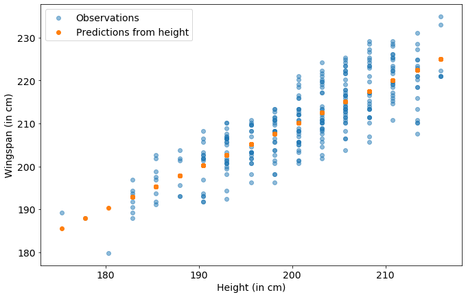
This is not a great prediction, the $R^2$ score is $0.69$ out of $1.0$.
The wingspan of the NBA population is more independent of the height of the players than the average population. I’m not going to use it in my model. Because I’m doing a linear regression this would basically just modify the coefficient on the height feature already in the data.
Create BMI
Do NBA players have similar BMIs? \(BMI = \frac{mass (kg)}{(height (m))^2}\) Typically this measurement is not useful for athletes because it does not distinguish fat weight from muscle weight. Note on BMI.
We have height in cm and mass in pounds, so to convert it I will use the formula: \(BMI = \frac{mass (lbs) / 2.2}{(height (cm)/100)^2}\)
joined_data['BMI']= (joined_data['Weight (in lb)']/2.2)/((joined_data['Height (in cm)']/100)**2)
plot_metric_salary('BMI',joined_data)

We have some players coming in “overweight” according to BMI (BMI > 25), but, as mentioned above, it doesn’t account for what type of tissue the weight is coming from.
Actually, those guys are some of the higher paid players!
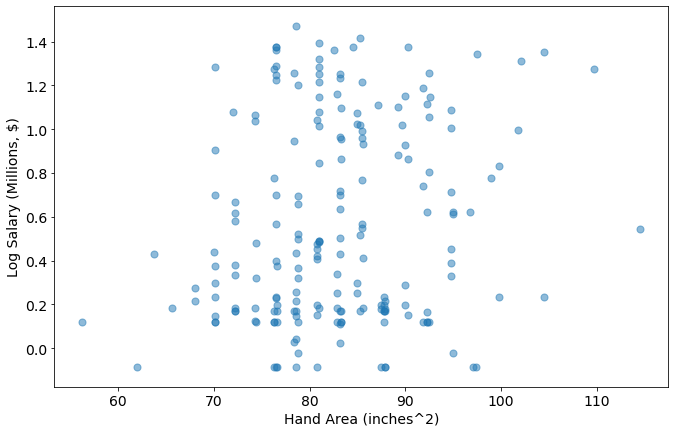
Create Hand Area
I think the surface area of the hand is more closely related to its impact on the game of basketball then either the width or length individually. I’m going to treat that as an ellipse and create it as a feature using: \(A = \pi * length * width\)
joined_data['Hand Area (inches^2)'] = joined_data['Hand Width (in inches)']*joined_data['Hand Length (in inches)']
metric='Hand Area (inches^2)'
plot_metric_salary(metric,joined_data)
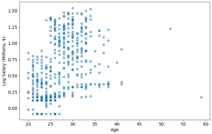
Create Age
I will use the birthdate column to calculate the age of the player in the 2017-2018 season.
joined_data['Birth Date'].head()
0    1/14/1985
1    9/16/1995
2    9/25/1993
3     6/3/1986
4     1/4/1985
Name: Birth Date, dtype: object
joined_data['Birth Date']=pd.to_datetime(joined_data['Birth Date'])
joined_data['Age'] = 2018 - pd.DatetimeIndex(joined_data['Birth Date']).year
joined_data.Age.head()
0    33
1    23
2    25
3    32
4    33
Name: Age, dtype: int64
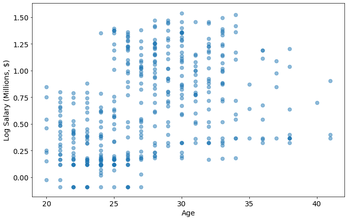
metric='Age'
plot_metric_salary(metric,joined_data)
Who is in the 45+ category?
joined_data[joined_data.Age > 45]
| Player Full Name | Birth Date | Year Start | Year End | Position | Height (ft 1/2) | Height (inches 2/2) | Height (in cm) | Wingspan (in cm) | Standing Reach (in cm) | ... | College | Player | Unnamed: 0 | Tm | season17_18 | Salary (Million USD) | Log Salary (M $) | BMI | Hand Area (inches^2) | Age | |
|---|---|---|---|---|---|---|---|---|---|---|---|---|---|---|---|---|---|---|---|---|---|
| 259 | Larry Nance | 1959-02-12 | 2016 | 2018 | F | 6.0 | 9.0 | 205.7 | 217.2 | 274.3 | ... | University of Wyoming | Larry Nance | 384 | CLE | 1471382.0 | 1.471382 | 0.167725 | 24.707942 | 87.75 | 59 |
| 389 | Tim Hardaway | 1966-09-01 | 2014 | 2018 | G | 6.0 | 6.0 | 198.1 | NaN | NaN | ... | University of Michigan | Tim Hardaway | 64 | NYK | 16500000.0 | 16.500000 | 1.217484 | 23.744456 | NaN | 52 |
2 rows × 24 columns
These are former pros with sons in the league with their same name. Per wikipedia, the biological stats for Larry Nance, and Tim Hardaway, match more closely to the Juniors (except for Birth Date), so I’m going to update the Birth Dates and recalculate the ages
player_salary[player_salary.Player.str.contains('Nance')], player_salary[player_salary.Player.str.contains('Hardaway')]
(     Unnamed: 0       Player   Tm  season17_18  Salary (Million USD)
 383         384  Larry Nance  CLE    1471382.0              1.471382,
     Unnamed: 0        Player   Tm  season17_18  Salary (Million USD)
 63          64  Tim Hardaway  NYK   16500000.0                  16.5)
These teams and salaries match the data from the 2017-2018 season.
joined_data.loc[joined_data['Player']=='Larry Nance','Birth Date'] = '1993-01-01' #Larry Nance Jr.
joined_data.loc[joined_data['Player']=='Tim Hardaway','Birth Date'] = '1992-03-16' #Tim Hardaway Jr.
joined_data['Birth Date']=pd.to_datetime(joined_data['Birth Date'])
joined_data['Age'] = 2018 - pd.DatetimeIndex(joined_data['Birth Date']).year
metric='Age'
plot_metric_salary(metric,joined_data)
joined_data[joined_data.Age > 39]
| Player Full Name | Birth Date | Year Start | Year End | Position | Height (ft 1/2) | Height (inches 2/2) | Height (in cm) | Wingspan (in cm) | Standing Reach (in cm) | ... | College | Player | Unnamed: 0 | Tm | season17_18 | Salary (Million USD) | Log Salary (M $) | BMI | Hand Area (inches^2) | Age | |
|---|---|---|---|---|---|---|---|---|---|---|---|---|---|---|---|---|---|---|---|---|---|
| 105 | Dirk Nowitzki | 1978-06-19 | 1999 | 2018 | F | 7.0 | 0.0 | 213.4 | NaN | NaN | ... | NaN | Dirk Nowitzki | 201 | DAL | 5000000.0 | 5.000000 | 0.698970 | 24.454263 | NaN | 40 |
| 179 | Jason Terry | 1977-09-15 | 2000 | 2018 | G | 6.0 | 2.0 | 188.0 | NaN | NaN | ... | University of Arizona | Jason Terry | 296 | MIL | 2328652.0 | 2.328652 | 0.367105 | 23.792131 | NaN | 41 |
| 274 | Manu Ginobili | 1977-07-28 | 2003 | 2018 | G | 6.0 | 6.0 | 198.1 | NaN | NaN | ... | NaN | Manu Ginobili | 277 | SAS | 2500000.0 | 2.500000 | 0.397940 | 23.744456 | NaN | 41 |
| 416 | Vince Carter | 1977-01-26 | 1999 | 2018 | G-F | 6.0 | 6.0 | 198.1 | NaN | NaN | ... | University of North Carolina | Vince Carter | 143 | SAC | 8000000.0 | 8.000000 | 0.903090 | 25.481856 | NaN | 41 |
4 rows × 24 columns
This checks out!
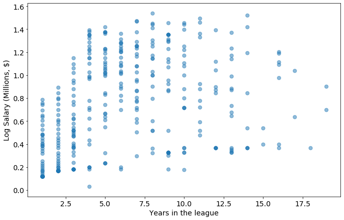
Create Years in the league
joined_data['Years in the league'] = 2018 - joined_data['Year Start']
metric='Years in the league'
plot_metric_salary(metric,joined_data)
Train the model
Before I do that, I definitely need to drop some columns. I’m going to address the categorical data (College, Position, Team) separately right now in case I want it later.
joined_data.columns
Index(['Player Full Name', 'Birth Date', 'Year Start', 'Year End', 'Position',
       'Height (ft 1/2)', 'Height (inches 2/2)', 'Height (in cm)',
       'Wingspan (in cm)', 'Standing Reach (in cm)', 'Hand Length (in inches)',
       'Hand Width (in inches)', 'Weight (in lb)', 'Body Fat (%)', 'College',
       'Player', 'Unnamed: 0', 'Tm', 'season17_18', 'Salary (Million USD)',
       'Log Salary (M $)', 'BMI', 'Hand Area (inches^2)', 'Age',
       'Years in the league'],
      dtype='object')
dropped_columns = ['Player Full Name', 'Birth Date', 'Year Start', 'Year End',
       'Height (ft 1/2)', 'Height (inches 2/2)','Unnamed: 0','season17_18','Player']
categorical_columns = ['Tm','Position','College']
joined_data_dropped = joined_data.drop(columns=dropped_columns)
joined_data_dropped = joined_data_dropped.drop(columns=categorical_columns)
joined_data_dropped.head()
| Height (in cm) | Wingspan (in cm) | Standing Reach (in cm) | Hand Length (in inches) | Hand Width (in inches) | Weight (in lb) | Body Fat (%) | Salary (Million USD) | Log Salary (M $) | BMI | Hand Area (inches^2) | Age | Years in the league | |
|---|---|---|---|---|---|---|---|---|---|---|---|---|---|
| 0 | 182.9 | 193.0 | 238.8 | NaN | NaN | 161.0 | 0.027 | 2.116955 | 0.325712 | 21.876396 | NaN | 33 | 10 |
| 1 | 205.7 | 212.7 | 266.7 | 8.75 | 10.5 | 220.0 | 0.051 | 5.504420 | 0.740712 | 23.633684 | 91.875 | 23 | 3 |
| 2 | 198.1 | NaN | NaN | NaN | NaN | 230.0 | NaN | 1.167333 | 0.067195 | 26.640122 | NaN | 25 | 0 |
| 3 | 208.3 | 215.3 | 271.8 | NaN | NaN | 245.0 | 0.091 | 27.734405 | 1.443019 | 25.666394 | NaN | 32 | 10 |
| 4 | 208.3 | 219.7 | 279.4 | NaN | NaN | 289.0 | 0.105 | 9.769821 | 0.989887 | 30.275869 | NaN | 33 | 13 |
Options for Nans
- Work on dataset of only intact rows
- Work on dataset of only intact columns
- Replace nan with median
Work on dataset with only intact rows
Let’s start with 1, and see how they all compare
training_data_intact_rows = joined_data_dropped.dropna()
training_data_intact_rows.head()
| Height (in cm) | Wingspan (in cm) | Standing Reach (in cm) | Hand Length (in inches) | Hand Width (in inches) | Weight (in lb) | Body Fat (%) | Salary (Million USD) | Log Salary (M $) | BMI | Hand Area (inches^2) | Age | Years in the league | |
|---|---|---|---|---|---|---|---|---|---|---|---|---|---|
| 1 | 205.7 | 212.7 | 266.7 | 8.75 | 10.50 | 220.0 | 0.051 | 5.504420 | 0.740712 | 23.633684 | 91.875 | 23 | 3 |
| 5 | 198.1 | 208.3 | 262.9 | 9.00 | 8.25 | 214.0 | 0.051 | 10.845506 | 1.035250 | 24.786896 | 74.250 | 27 | 6 |
| 7 | 215.9 | 222.3 | 0.0 | 9.00 | 10.75 | 260.0 | 0.064 | 4.187599 | 0.621965 | 25.353936 | 96.750 | 25 | 4 |
| 8 | 205.7 | 221.6 | 275.6 | 9.50 | 9.50 | 220.0 | 0.082 | 7.319035 | 0.864454 | 23.633684 | 90.250 | 28 | 7 |
| 10 | 198.1 | 211.5 | 262.9 | 8.25 | 8.50 | 210.0 | 0.047 | 19.332500 | 1.286288 | 24.323589 | 70.125 | 26 | 4 |
X = training_data_intact_rows.drop(columns=['Salary (Million USD)','Log Salary (M $)'])
y = training_data_intact_rows[['Log Salary (M $)']]
model = make_pipeline(StandardScaler(), LinearRegression())
model.fit(X,y)
print('score: '+str(model.score(X,y)))
score: 0.6153114126697995
That’s a good score, but how does it predict outside of the training data?
To answer that, I’m going to fill in the values for the players I removed with the median values for each category.
training_data_filled = joined_data_dropped.fillna(joined_data_dropped.median())
X_filled = training_data_filled.drop(columns=['Salary (Million USD)','Log Salary (M $)'])
y_filled = training_data_filled[['Log Salary (M $)']]
model.score(X_filled,y_filled)
-0.9542480606293884
This model is overfit - when I evaluate my dataset with other players given reasonable values for hand size, reach, wingspan, etc, it fails spectacularly.
y_filled.insert(0,"Salary (M $)",10**y_filled['Log Salary (M $)'])
y_filled.insert(0,"Predicted Log Salary", model.predict(X_filled))
y_filled.insert(0,"Predicted Salary (M $)",10**y_filled["Predicted Log Salary"])
data=y_filled
x_dim = 'Salary (M $)'
y_dim = 'Salary (M $)'
plt.scatter(
    data=y_filled,
    x=x_dim,
    y=y_dim,
    label='Observations',
    alpha=0.5)
y_dim = 'Predicted Salary (M $)'
plt.scatter(
    data=y_filled,
    x=x_dim,
    y=y_dim,
    label='Predictions',
    alpha=0.5,)
plt.xlabel(x_dim)
plt.ylabel(y_dim)
plt.legend()
plt.show()
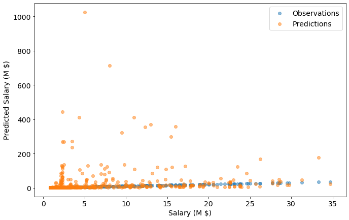
Who is that we predict should be puling in $1B?
joined_data.iloc[y_filled["Predicted Salary (M $)"].idxmax()].head()
Player Full Name          Dirk Nowitzki
Birth Date          1978-06-19 00:00:00
Year Start                         1999
Year End                           2018
Position                              F
Name: 105, dtype: object
Per Wikipeida, Dirk Nowitzki “is widely regarded as one of the greatest power forwards of all time and is considered by many to be the greatest European player of all time.”
So maybe the Mavs were getting a deal! Or maybe the model is flawed.
Work on dataset with only intact columns
columns_with_na =[]
for column in joined_data_dropped.columns:
    if np.sum(joined_data_dropped[column].isna()):
        columns_with_na.append(column)
training_data_intact_cols=joined_data_dropped.drop(columns=columns_with_na)
training_data_intact_cols.head()
| Height (in cm) | Weight (in lb) | Salary (Million USD) | Log Salary (M $) | BMI | Age | Years in the league | |
|---|---|---|---|---|---|---|---|
| 0 | 182.9 | 161.0 | 2.116955 | 0.325712 | 21.876396 | 33 | 10 |
| 1 | 205.7 | 220.0 | 5.504420 | 0.740712 | 23.633684 | 23 | 3 |
| 2 | 198.1 | 230.0 | 1.167333 | 0.067195 | 26.640122 | 25 | 0 |
| 3 | 208.3 | 245.0 | 27.734405 | 1.443019 | 25.666394 | 32 | 10 |
| 4 | 208.3 | 289.0 | 9.769821 | 0.989887 | 30.275869 | 33 | 13 |
X = training_data_intact_cols.drop(columns=['Salary (Million USD)','Log Salary (M $)'])
y = training_data_intact_cols[['Log Salary (M $)']]
model = make_pipeline(StandardScaler(), LinearRegression())
model.fit(X,y)
print('score: '+str(model.score(X,y)))
score: 0.2710707378505274
The scores are lower for this - this is as expected. There are more examples and fewer categories.
Work with filling NaN with median
training_data_filled = joined_data_dropped.fillna(joined_data_dropped.median())
X = training_data_filled.drop(columns=['Salary (Million USD)','Log Salary (M $)'])
y = training_data_filled[['Log Salary (M $)']]
model = make_pipeline(StandardScaler(), LinearRegression())
model.fit(X,y)
print('score: '+str(model.score(X,y)))
score: 0.2827808374769417
Test the model
Test/train split
Preprocessing
I’m going to try some polynomial features here on the “intact columns” dataset.
I’m choosing that because many of the features I added are multiplicative of one another, so adding polynomial features will only amplify this.
I’m also choosing to drop BMI for the same reason: it’s a product of height and weight.
X = training_data_intact_cols.drop(columns=['Salary (Million USD)','Log Salary (M $)','BMI'])
y = training_data_intact_cols[['Log Salary (M $)']]
X_train, X_test, y_train, y_test = train_test_split(X, y, test_size=0.5, random_state=42)
score_list =[]
degrees = list(range(1,5))
for degree in degrees:
    model = make_pipeline(StandardScaler(), PolynomialFeatures(degree, include_bias=False), Ridge())
    model.fit(X_train,y_train)
    train_score = model.score(X_train, y_train)
    test_score = model.score(X_test, y_test)
    score_list.append([train_score, test_score])
plt.plot(degrees, score_list, marker='o')
plt.legend(['Training data','Testing data'])
plt.xlabel('Polynominal degree')
plt.ylabel('R^2 score')
plt.show()
Polynomial degree of 2 has a slightly higher score on the testing data - above 2 we begin overfitting. This is a high variance error. We will use degree 2 for the following predictions.
Predicitions/Production
model = make_pipeline(StandardScaler(), PolynomialFeatures(2, include_bias=False), Ridge())
model.fit(X,y) #train on the full dataset
model.feature_names_in_
array(['Height (in cm)', 'Weight (in lb)', 'Age', 'Years in the league'],
      dtype=object)
RWL_stats = {
            X.columns[0]:[180.4],  #5'11" (height in cm)
            X.columns[1]:[175], # weight in lbs
            X.columns[2]:[29], #age
            X.columns[3]:[0], #years in league
            }
RWL_df = pd.DataFrame.from_dict(RWL_stats)
RWL_df
| Height (in cm) | Weight (in lb) | Age | Years in the league | |
|---|---|---|---|---|
| 0 | 180.4 | 175 | 29 | 0 |
log10_RWL_salary = model.predict(RWL_df)
RWL_salary = 10**log10_RWL_salary
RWL_salary[0][0]
1.0938939170193462
So, a fair salary for me would be $1,090,000 a year.
Coach Ham, I already live in LA. My application is in the mail!
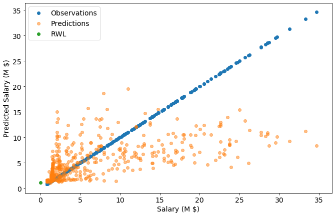
y_pred = y
y_pred.insert(0,"Salary (M $)",10**y_pred['Log Salary (M $)'])
y_pred.insert(0,"Predicted Log Salary", model.predict(X))
y_pred.insert(0,"Predicted Salary (M $)",10**y_pred["Predicted Log Salary"])
x_dim = 'Salary (M $)'
y_dim = 'Salary (M $)'
plt.scatter(
    data=y_pred,
    x=x_dim,
    y=y_dim,
    label='Observations')
y_dim = 'Predicted Salary (M $)'
plt.scatter(
    data=y_pred,
    x=x_dim,
    y=y_dim,
    label='Predictions',
    alpha=0.5,)
plt.scatter(
    x=0,
    y=RWL_salary,
    label='RWL',
    alpha=1,)
plt.xlabel(x_dim)
plt.ylabel(y_dim)
plt.legend()
plt.show()
plt.subplots(1,2,figsize=(22,7))
plt.subplot(1,2,1)
data=y_filled
x_dim = 'Salary (M $)'
y_dim = 'Salary (M $)'
plt.scatter(
    data=y_filled,
    x=x_dim,
    y=y_dim,
    label='Observations')
y_dim = 'Predicted Salary (M $)'
plt.scatter(
    data=y_filled,
    x=x_dim,
    y=y_dim,
    label='Predictions',
    alpha=0.5,)
plt.xlabel(x_dim)
plt.ylabel(y_dim)
plt.title('Predictions with all biometrics')
plt.ylim([0,1100])
plt.legend()
plt.subplot(1,2,2)
x_dim = 'Salary (M $)'
y_dim = 'Salary (M $)'
plt.scatter(
    data=y_pred,
    x=x_dim,
    y=y_dim,
    label='Observations')
y_dim = 'Predicted Salary (M $)'
plt.scatter(
    data=y_pred,
    x=x_dim,
    y=y_dim,
    label='Predictions',
    alpha=0.5,)
plt.xlabel(x_dim)
plt.ylabel(y_dim)
plt.ylim([0,1100])
plt.title('Predictions with height, weight, age, and years')
plt.legend()
plt.show()
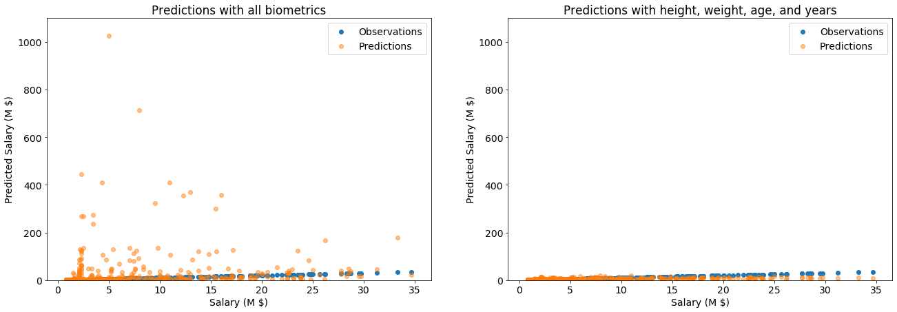
When viewed on the same scale, the model with fewer features is doing much better. But it’s $R^2$ score was still only 0.45, which is not great. We must wonder:
Why is this model doing so badly?
Or, why am worth more than minimum wage for an NBA player?
coef_df = pd.DataFrame(
    zip(
    list(model['polynomialfeatures'].get_feature_names_out(model.feature_names_in_)),
    list(model['ridge'].coef_,)[0]), columns=['Category','Coefficient']
)
coef_df.insert(2,'Magntitute of coef',np.abs(model['ridge'].coef_,)[0])
coef_df.sort_values(by=['Magntitute of coef'],ascending=False)
| Category | Coefficient | Magntitute of coef | |
|---|---|---|---|
| 3 | Years in the league | 0.579669 | 0.579669 |
| 12 | Age Years in the league | -0.393072 | 0.393072 |
| 2 | Age | -0.244206 | 0.244206 |
| 11 | Age^2 | 0.140130 | 0.140130 |
| 13 | Years in the league^2 | 0.077877 | 0.077877 |
| 0 | Height (in cm) | 0.048072 | 0.048072 |
| 6 | Height (in cm) Age | 0.044353 | 0.044353 |
| 7 | Height (in cm) Years in the league | -0.034242 | 0.034242 |
| 5 | Height (in cm) Weight (in lb) | 0.026550 | 0.026550 |
| 9 | Weight (in lb) Age | 0.021481 | 0.021481 |
| 4 | Height (in cm)^2 | -0.019526 | 0.019526 |
| 1 | Weight (in lb) | -0.017313 | 0.017313 |
| 10 | Weight (in lb) Years in the league | -0.016464 | 0.016464 |
| 8 | Weight (in lb)^2 | -0.003941 | 0.003941 |
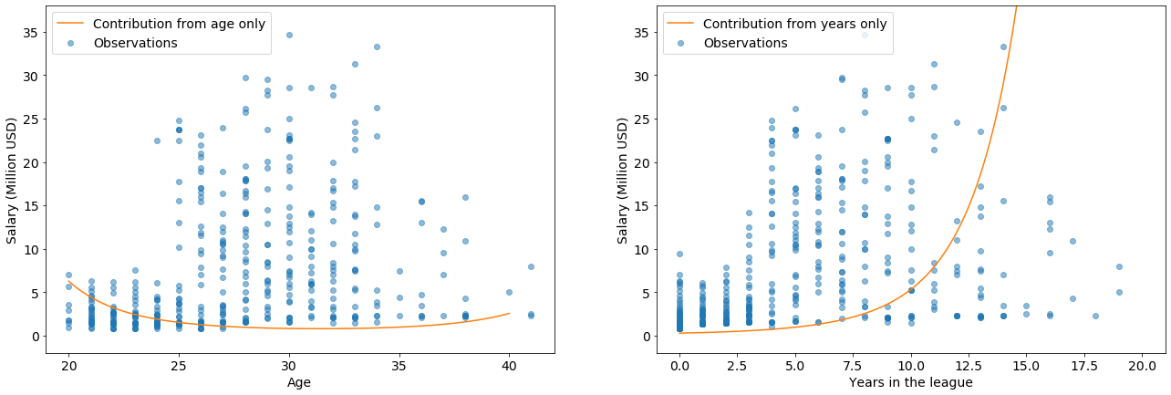
I really like this analysis because it finds that age and years in the league are more important than height or weight.
Not only that, but the quadratic features of Age$^2$ and years$^2$ match my intuition and represent two different cases of high salary:
Young players have high potential: teams are eager to get young, talented players, and incentivize them with high salaries.
Players with more years in the league are more experienced and known quantities, which is valuable in a different way. There could also be some survivorship basis at play here: Perhaps only the good (valuable) players play for many years. In that case, they are valuable for another reason (high skill), which correlates with years in the league.
Age$^2$ has a positive coefficient with high magnitude, because there players at both ends of that parabola are valuable. I draw a similar conclusion from the high magnitude, positive coefficient on years$^2$
X_uniform = pd.DataFrame({"Age":np.linspace(20,40,num=len(X)), "Years in the league":np.linspace(0,20,num=len(X))})
X.update(X_uniform)
scaled_X=model['standardscaler'].transform(X)
scaled_age = scaled_X[:,2]
scaled_years=scaled_X[:,3]
age_coef, age2_coef = (np.array(coef_df.loc[coef_df['Category']=='Age','Coefficient']),
                       np.array(coef_df.loc[coef_df['Category']=='Age^2','Coefficient']))
age_salary = scaled_age*(age_coef)+(scaled_age**2)*(age2_coef)
years_coef, years2_coef =  (np.array(coef_df.loc[coef_df['Category']=='Years in the league','Coefficient']),
                            np.array(coef_df.loc[coef_df['Category']=='Years in the league^2','Coefficient']))
years_salary =scaled_years*(years_coef)+(scaled_years**2)*(years2_coef)
plt.subplots(1,2,figsize=(22,7))
plt.subplot(1,2,1)
x_dim='Age'
y_dim='Salary (Million USD)'
plt.scatter(
    data=joined_data,
    x=x_dim,
    y=y_dim,
    label='Observations',
    alpha=0.5,
)
plt.plot(X_uniform['Age'],10**age_salary,
        label="Contribution from age only",
         color='#ff7f0e')
plt.xlabel(x_dim)
plt.ylabel(y_dim)
plt.ylim([-2,38])
plt.legend()

plt.subplot(1,2,2)
x_dim='Years in the league'
plt.scatter(
    data=joined_data,
    x=x_dim,
    y=y_dim,
    label='Observations',
    alpha=0.5,

)
plt.plot(X_uniform['Years in the league'],10**years_salary,
        label="Contribution from years only",
         color='#ff7f0e')
plt.xlabel(x_dim)
plt.ylabel(y_dim)
plt.ylim([-2,38])
plt.legend()
plt.show()
This calculation neglected the cross term of $age*years$. Let’s include it and re-evaluate.
X_uniform = pd.DataFrame({"Age":np.linspace(20,40,num=len(X)), "Years in the league":np.linspace(0,20,num=len(X))})
X.update(X_uniform)
scaled_X=model['standardscaler'].transform(X)
scaled_age = scaled_X[:,2]
scaled_years=scaled_X[:,3]
age_years_coef = np.array(coef_df.loc[coef_df['Category']=='Age Years in the league','Coefficient'])
age_years_salary = scaled_age*(age_coef)+(scaled_age**2)*(age2_coef)+(scaled_age*scaled_years)*(age_years_coef)
x_dim='Age'
y_dim='Salary (Million USD)'
plt.scatter(
    data=joined_data,
    x=x_dim,
    y=y_dim,
    label='Observations',
    alpha=0.5
)
plt.plot(X_uniform['Age'],10**age_years_salary,
        label="Contribution from age and years",
         color='#ff7f0e')
plt.xlabel(x_dim)
plt.ylabel(y_dim)
plt.ylim([-2,38])
plt.legend()
plt.show()
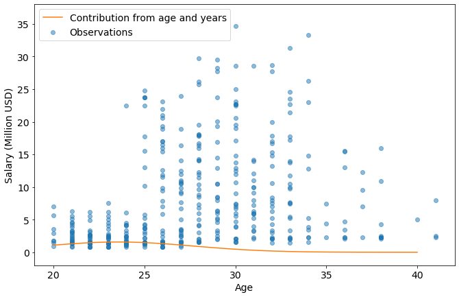
The little bump centered around 23 years old is showing that NBA salaries are rewarding the rare combination of low age and high experience. After an age of about 28, the negatives of age overtakes benefit from experience.